最近一直在使用Python做数据分析,用到的Python图表功能,目前主要使用的是Matplotlib,现在基于Matplotlib做一个简单的小结。
Matplotlib 是Python中类似 MATLAB 的绘图工具,熟悉 MATLAB 也可以很快的上手 Matplotlib。
1、Figure
在任何绘图之前,我们需要一个Figure对象,可以理解成我们需要一张画板才能开始绘图。
import matplotlib.pyplot as plt
fig = plt.figure()
2、Axes
在拥有Figure对象之后,在作画前我们还需要轴,没有轴的话就没有绘图基准,所以需要添加Axes。也可以理解成为真正可以作画的纸。
fig = plt.figure()
ax = fig.add_subplot(111)
ax.set(xlim=[0.5, 4.5], ylim=[-2, 8], title='An Example Axes',
ylabel='Y-Axis', xlabel='X-Axis')
plt.show()
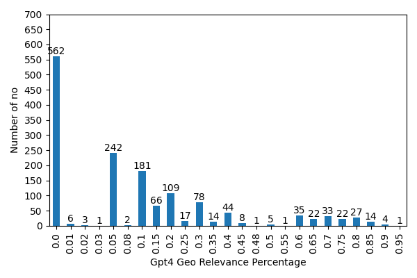
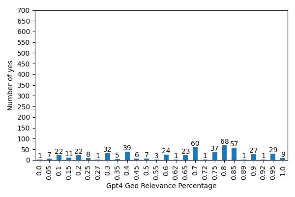
3、直方图
接下来说一下直方图,直方图平时用得比较多,所以接下来介绍下直方图的基本知识。直方图一般用于统计数据出现的次数或者频率,有多种参数可以调整,见下例:
np.random.seed(19680801)
n_bins = 10
x = np.random.randn(1000, 3)
fig, axes = plt.subplots(nrows=2, ncols=2)
ax0, ax1, ax2, ax3 = axes.flatten()
colors = ['red', 'tan', 'lime']
ax0.hist(x, n_bins, density=True, histtype='bar', color=colors, label=colors)
ax0.legend(prop={'size': 10})
ax0.set_title('bars with legend')
ax1.hist(x, n_bins, density=True, histtype='barstacked')
ax1.set_title('stacked bar')
ax2.hist(x, histtype='barstacked', rwidth=0.9)
ax3.hist(x[:, 0], rwidth=0.9)
ax3.set_title('different sample sizes')
fig.tight_layout()
plt.show()
参数中density控制Y轴是概率还是数量,与返回的第一个的变量对应。histtype控制着直方图的样式,默认是 ‘bar’,对于多个条形时就相邻的方式呈现, ‘barstacked’ 就是叠在一起,rwidth 控制着宽度,这样可以空出一些间隙。下面是一些直方图样例:
以上就是关于Python Matplotlib的小结,感谢阅读!